Honda BigWing
Honda Motor Company — Honda BigWing
Brand Identity
Graphic Design
Environmental Graphic System
Agency: Whitespace
Honda motorbikes have been a staple in shaping mobility in South and Southeast Asia for decades — providing affordable, reliable and quick transportation options for the masses.
Honda recognized the region’s rapid development and economic prosperity also increased consumer demand for a more luxurious and performance driven transportation experience while maintaining the convenience of the two wheel form factor. Honda’s regional strategy to increase sales of larger more powerful motorcycles lead to the creation of Honda BigWing.
This effort to launch Honda BigWing required developing a new brand identity that distinguished the more powerful motorcycles from the smaller scooter-like motorbikes. That's when Honda partnered with Whitespace — Asia’s premier branding and interior architecture studio specializing in retail + hospitality design to help develop a new brand identity and design system for all of the new Honda BigWing flagship stores. As a Senior Designer under the direction of the Creative Director — we developed a new brand mark for Honda BigWing that was inspired by history and evolution of the Honda wing logo first seen in 1947.
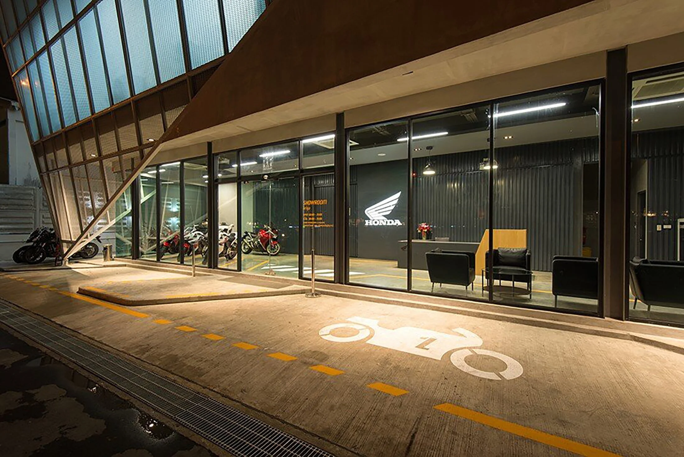
The scope of this project encompassed developing the Honda BigWing brand identity, visual design system, environmental graphics, and signage system, retail space experience and environment that would be used as the standard across all Honda BigWing retail spaces. The inaugural Honda BigWing established in Bangkok, Thailand, paved the way for the expansion to multiple locations across Thailand, India, Malaysia, and Indonesia.

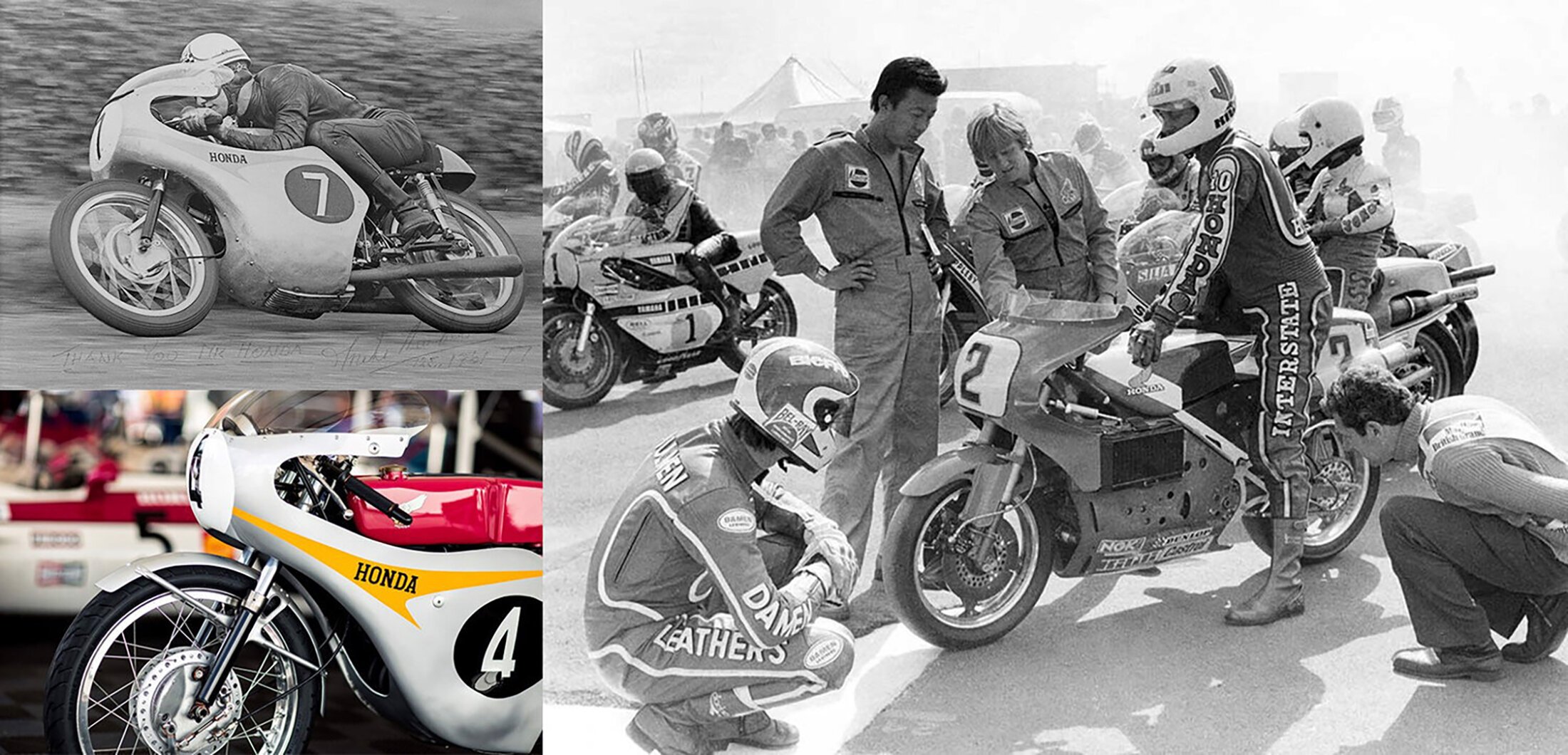
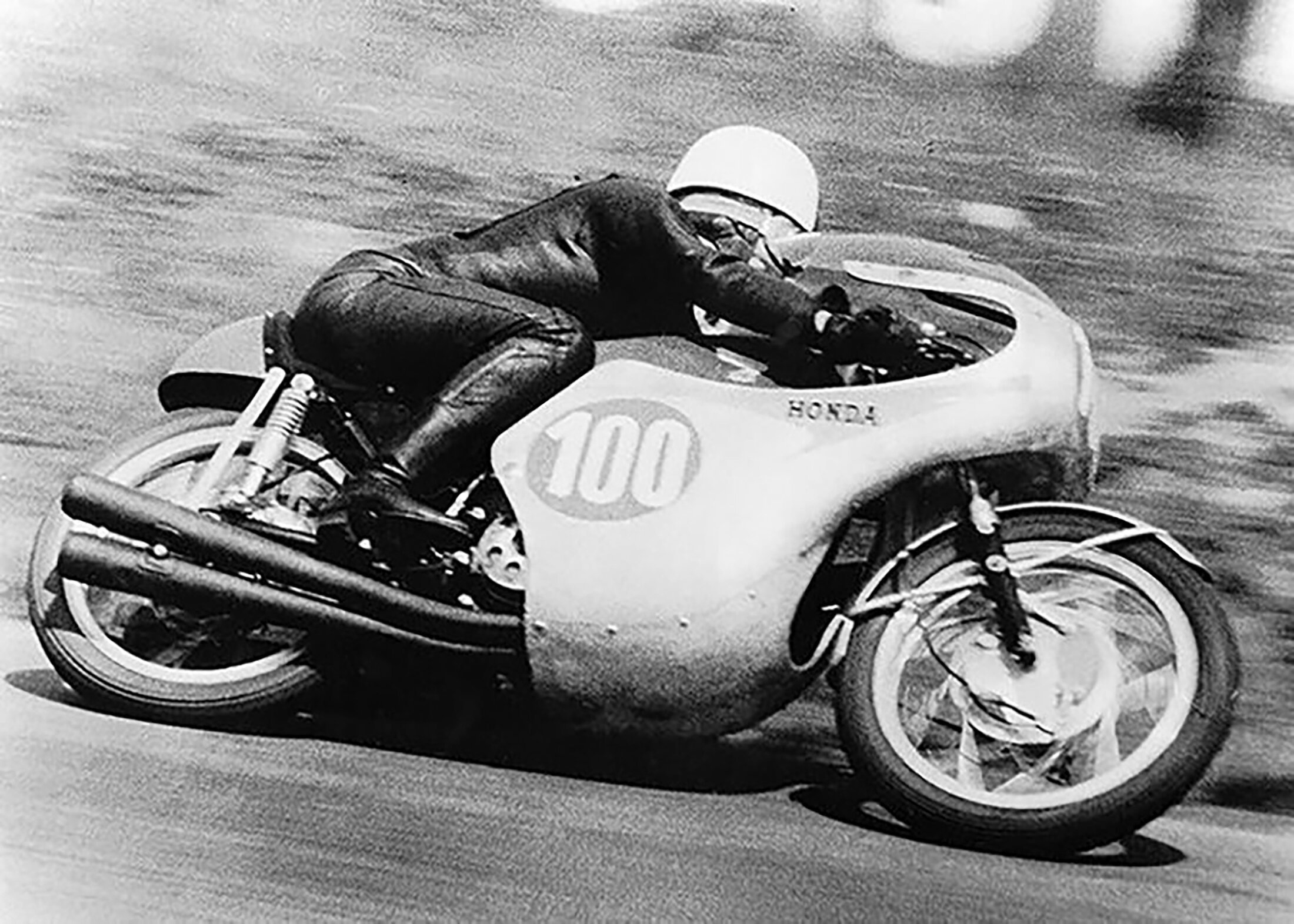
The evolution of an iconic brand
In the latest Honda wing logo from 1988 the mark was made more dynamic by adding a dramatic angle to the wing — which emphasized the sense of speed and motion. It was also simplified and modernized by reducing colors, removing outlines and using negative space to create a powerful and versatile mark. We carefully studied the heritage of the company and wanted to ensure that the new Honda BigWing mark would pay homage to the history of the brand while appealing to a more performance demanding segment. The final visual identity system we developed was infused in a dynamic angle shift that mimicked the forward motion of the Honda wing logo and we also used cuts into the letterform to pay homage to segmented wing of the traditional of the Honda wing logo.


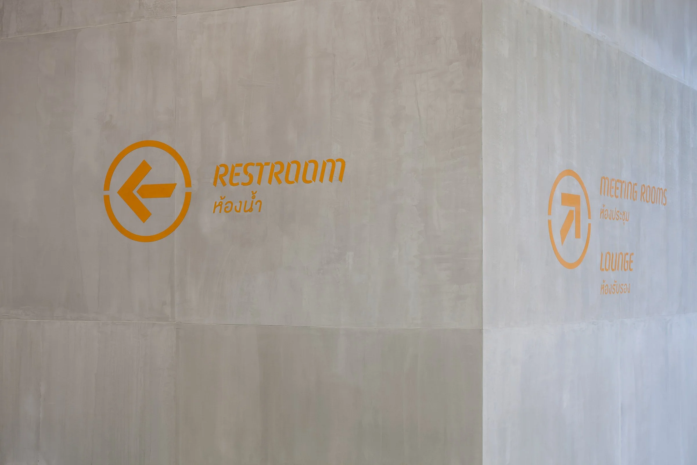

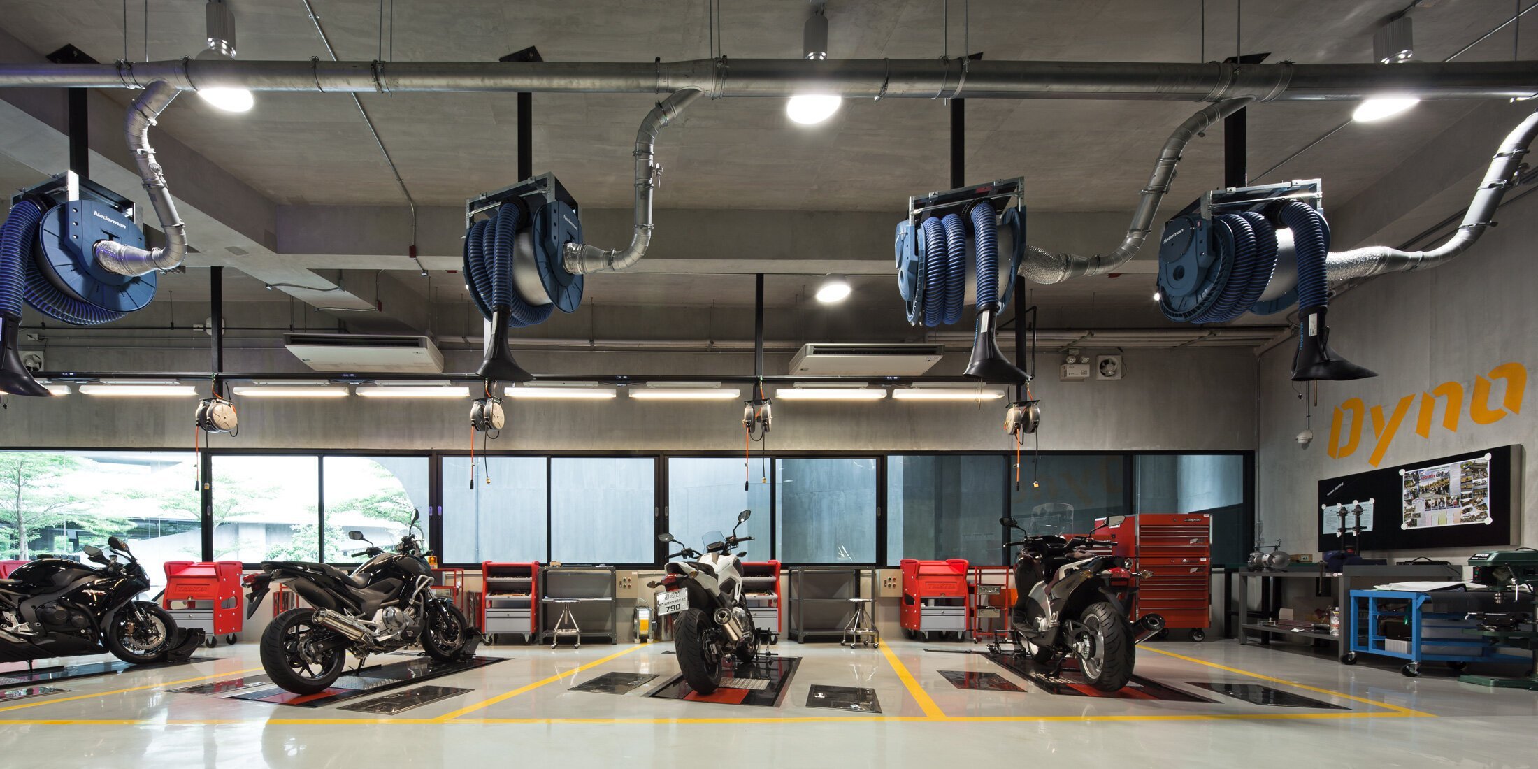

Track inspired
The visual system of all Honda BigWing showrooms were designed to evoke customer’s and worker’s excitement for riding. The track theme visuals provide emotional cues bringing people back to their days on the tracks.